Vancouver Public Library Wayfinding
// concept, wayfinding, recognition, production
Vancouver public library, wayfinding

Modernizing the wayfinding at the Vancouver Public Library required creating objects that stood out in a visually complex environment where sight-lines were limited. A guiding principle was to utilize high contrast and accents of the existing brand.

Maps were the most complex element of the new wayfinding system. I wanted to maintain minimalism and subtly imply a spatial relation to the viewer without veering into skeuomorphism.
The maps also had to display unique, specific categories while and allow for future updates uniquely. To cap it off, the building is oval-shaped, which resulted in abstraction for ease-of-use.

Though it looks simple from a distance, I wanted the structures to have small depth elements, such as this router-cut number.

The smaller, wall-mounted Info panels use a similar format as the Directories but with simple text and large icons. I intentionally left these fairly blank in case the client wanted to add information or a second language. In that scenario, all they would have to do is apply a new decal to the panel's face.
To differentiate it from the larger directories, I made the top dark grey, which allowed it to stand out from whatever surface it was placed on, especially a white wall.

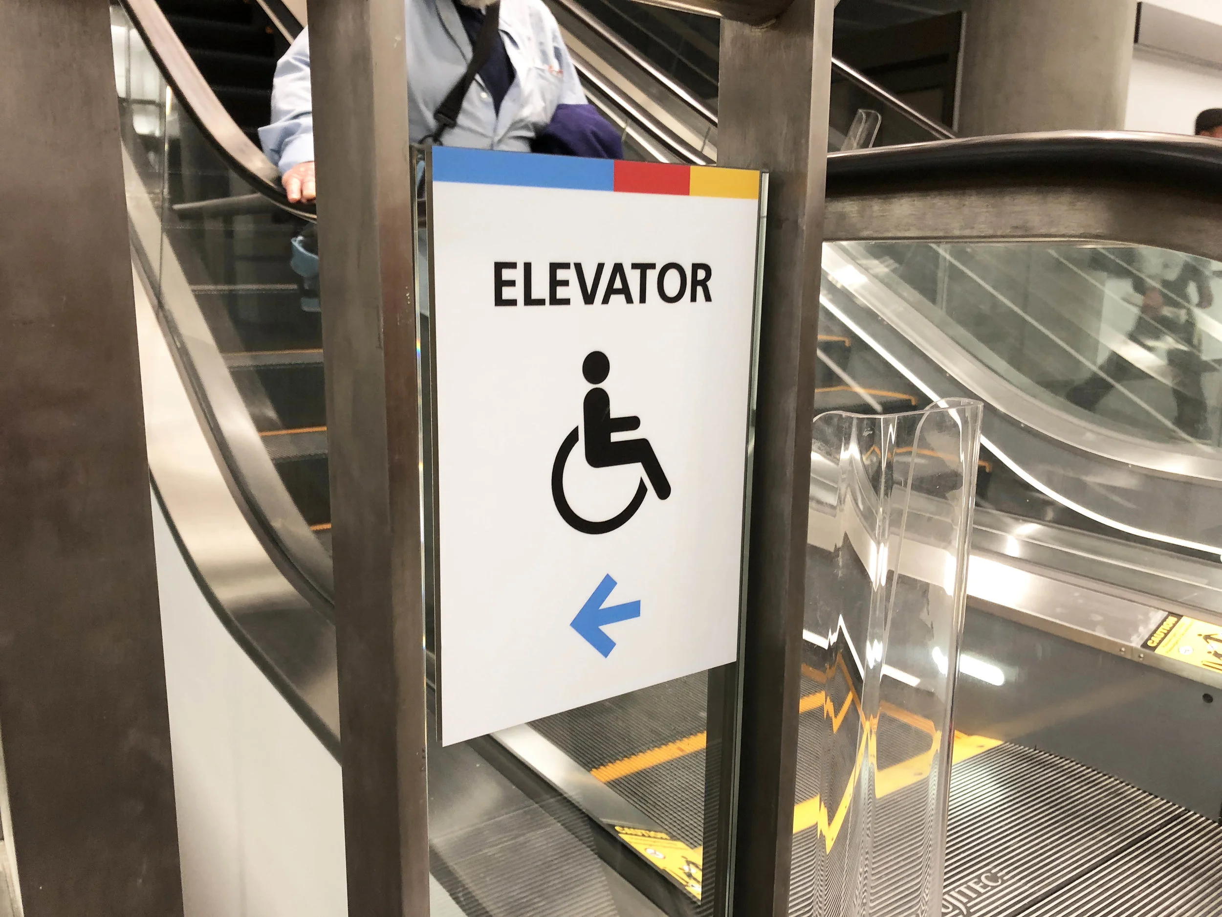
As a visitor ascends or descends via escalator, they’ll see a number on the railing informing them of their new floor. For visitors with limited mobility, the opposite side of this decal points to the nearest elevator.

Elevator door decals are minimal, with a bold floor level number and a simple navigational aid. For “Staff Only” elevators, I used large icons in brand-appropriate colours in place of the floor number.

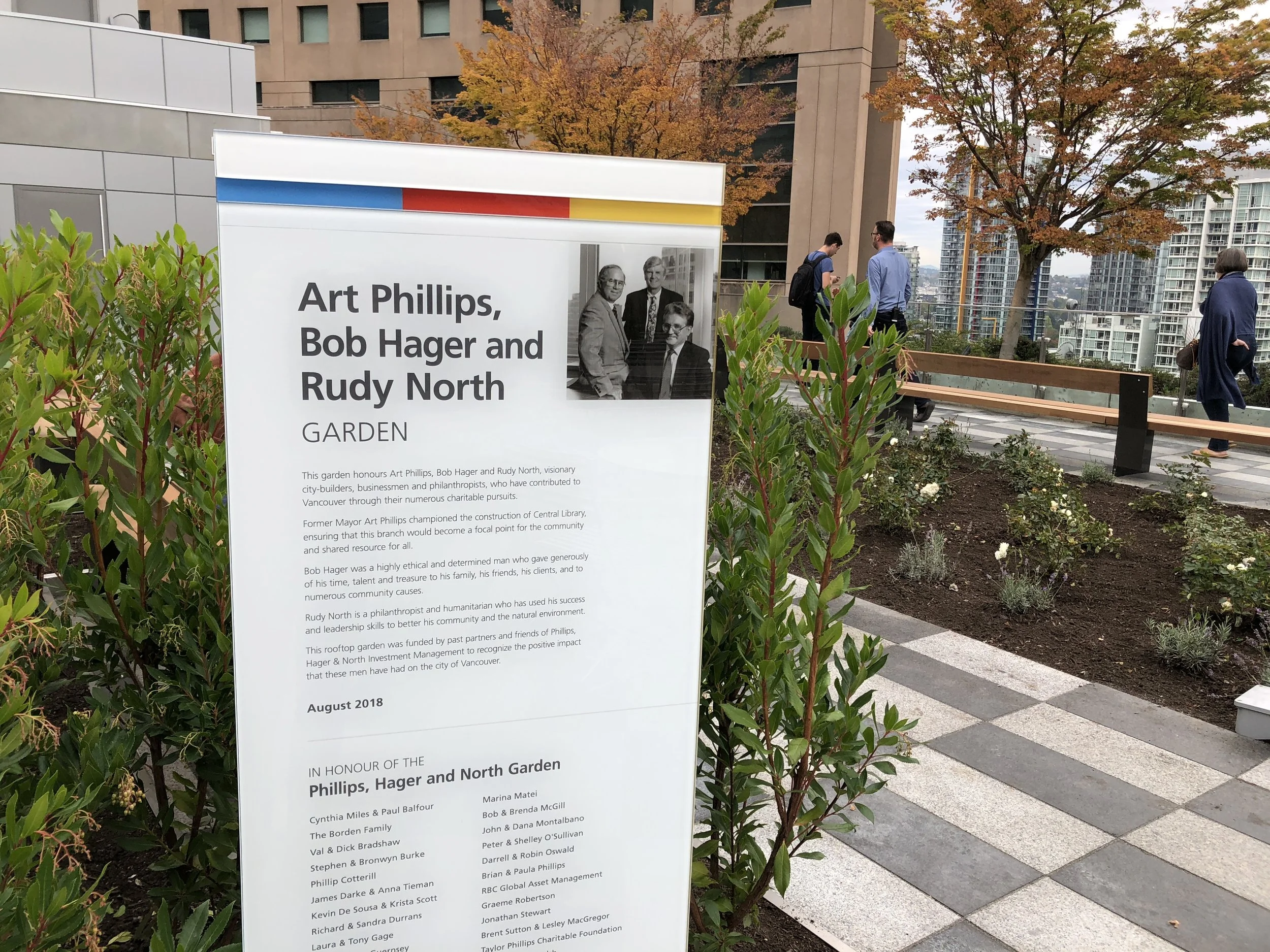
Financial support of the Vancouver Public Library is recognized through a mix of named areas, plaques, and garden installations. The extent of my work was limited to the plaques' design, from which the rest of the recognition work was derived.

Plaques were sized based on the level of donation. Larger plaques would contain longer write-ups or more dimensional fabrication. The shape of the plaque was derived from the angles of the blocks in the VPL logo.

Much of the donor recognition was installed in the central branch’s new rooftop garden. This includes a large donor wall and metal “flowers”; however, another designer handled these.

Overall, I’m happy to have had the opportunity to design something for such an iconic Vancouver location. I worked at a library for years and always wanted to design a wayfinding system for one. VPL was wonderful to work with, so it was a dream come true, even if the timeline was shorter than expected.
Ask any designer about their work years later, and they’ll cringe at the imperfections. I’m no different, but I hope that what I designed will be the foundation for someone else to refine and build on.